Portfolio Reflection
This is a self-directed project aimed to improve the layout and contents of my portfolio.

Process Overview
Background
Throughout my career as a UX Designer, I have developed skills in research, visual design, interaction design, critical thinking and problem solving. This expertise should be applied to my portfolio as much as it is in my professional work. The following case study explains the process and design thinking behind my website.
Mood Board
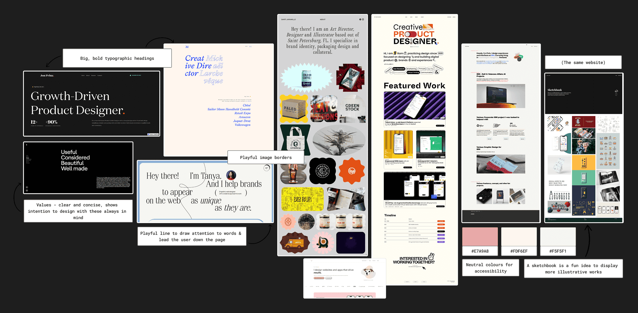
When exploring existing portfolios, I particularly enjoyed the use of playful image borders and neutral colour palettes. I wanted my portfolio to feel soft for visual comfort (Mockflow, 2025), but didn’t want to be afraid to use bold typography to “enhance navigation” (Mantzios, 2023). The examples here achieved this balance.
Portfolio Tool

Having previously worked with WordPress on self-directed projects, it seemed like the optimal tool to craft my portfolio with. I did not feel proficient enough in code to build my website from scratch, and WordPress offered many attractive templates; I chose “Coach Ava”.
I enjoyed the use of colour that was contrasting but not jarring, along with the overall structure, and was inspired by this. I intended to change most of the existing hierarchy to a simpler blog layout for my case studies, however.
Wireframes
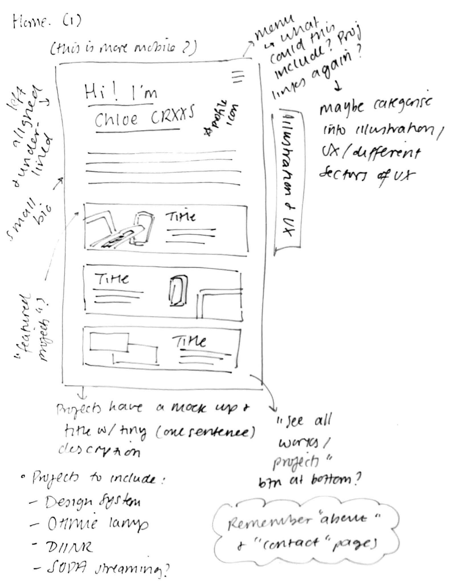
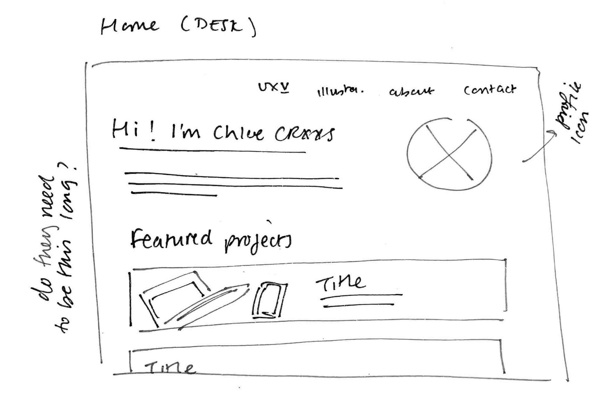

These were some of my initial sketches; they are relatively rough and include multiple annotations. I used these as a way to get my ideas down quickly on a page. Ideally I would have done more planning than this, but my chosen WordPress theme was not overly flexible when it came to implementation.
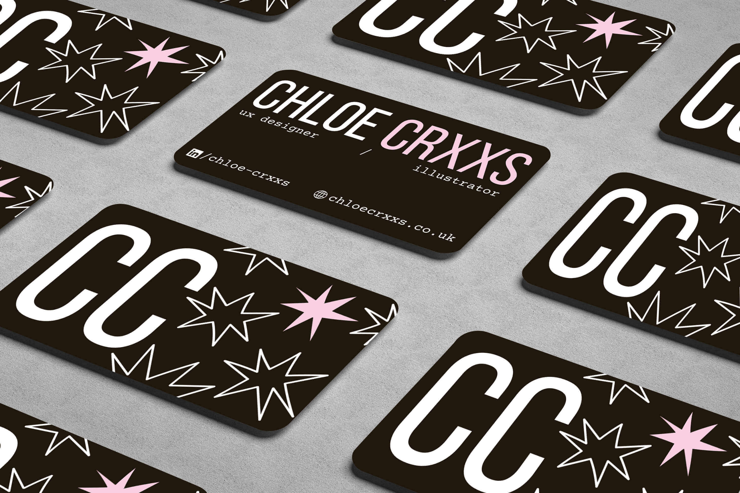
Style Tile
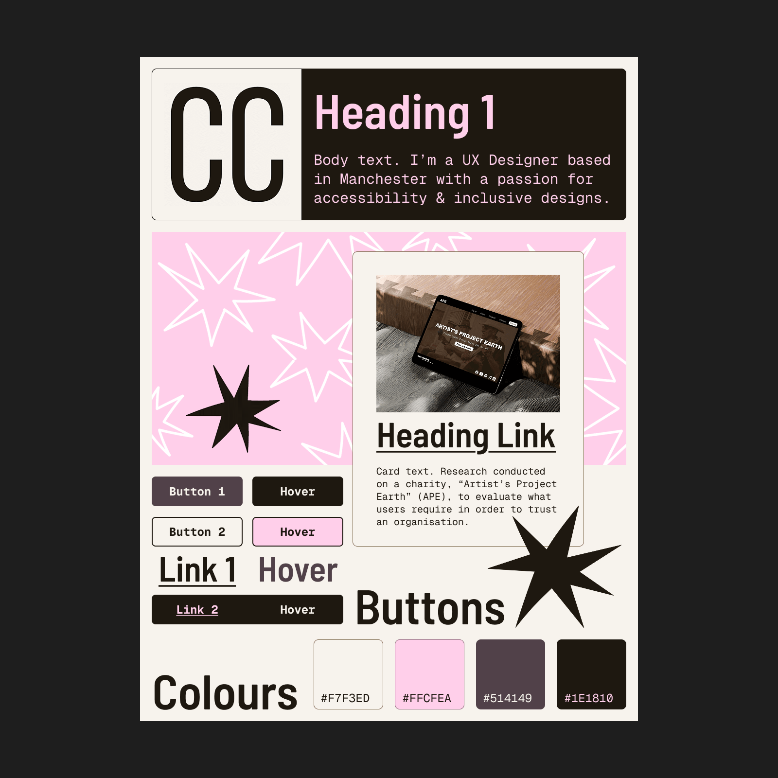
Instead of one logo, I chose to use hand drawn star motifs to represent my brand and aesthetic, and to “create a sense of consistency and coherence” (B., 2023). Using my moodboard as inspiration, I chose mostly muted colours and decided on a bold heading font to contrast with the body – something that is “essential for accessibility and readability” (M., 2024). I also checked my colours against WCAG guidelines to ensure my contrast was appropriate (WebAIM, 2025).
Early Designs
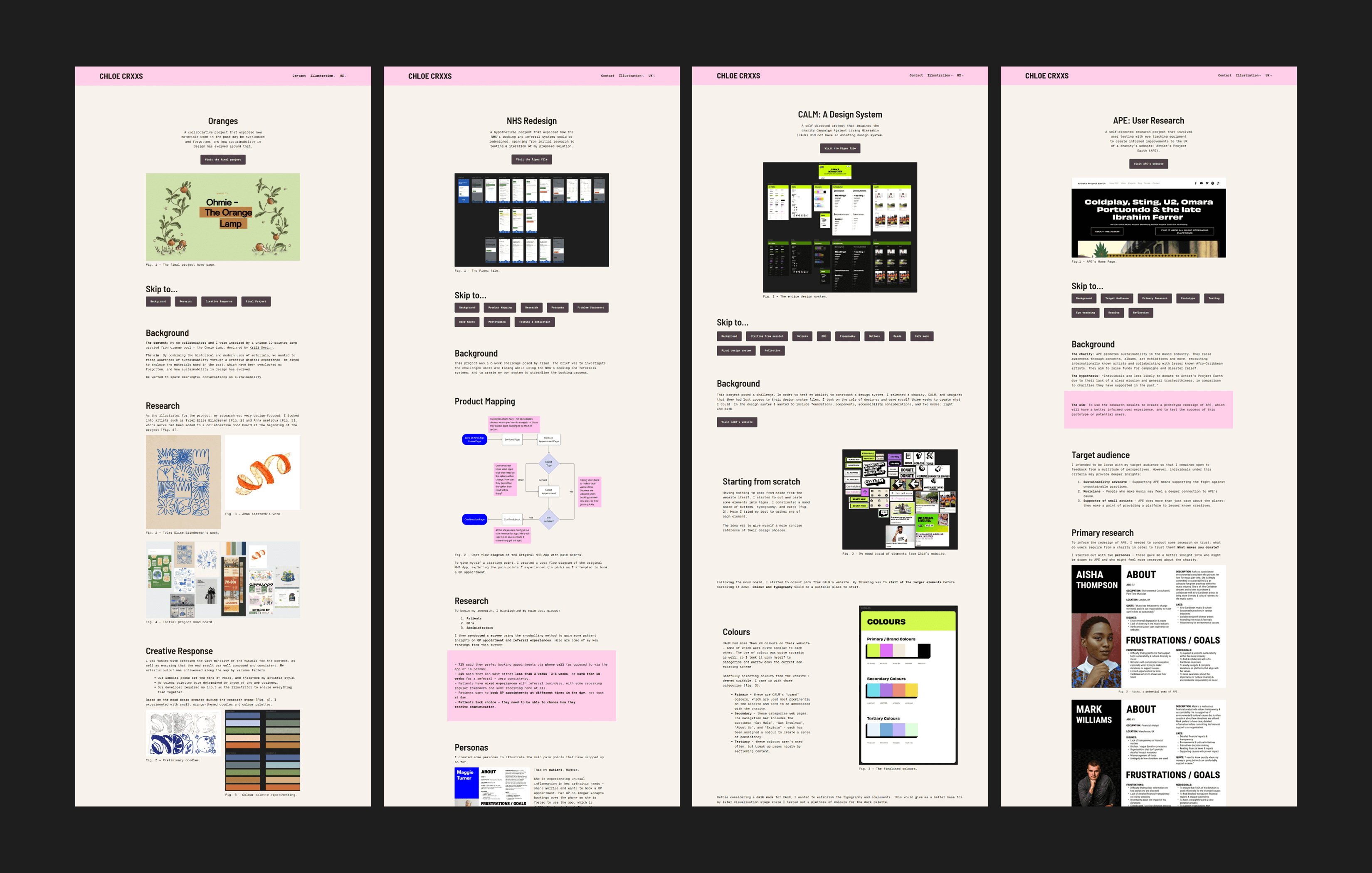
Before this case study, my portfolio used this layout. Each project was displayed inconsistently, and prioritised text over visuals. It was important to me to illustrate my points concisely and with supporting imagery, but this was difficult to do as I wanted to talk about each aspect of my design thinking.
Feedback & Reflections

I received feedback from an anonymous peer, industry professional, and a Senior Consultant at Triad (Maddison Ludlam). Based on their recommendations, I made appropriate changes to my portfolio.
I was previously worried about the volume of text in my case studies, and had scaled it down as prompted by the feedback. During my meeting with Maddison, she explained that it’s important to leave users with some insight into my UX process and stated that my scaled down explanations were appropriate, which reassured me.
The negativity of my previous case study reflections was brought to my attention by the anonymous industry professional. They explained that I should reframe my reflections as “outcomes”, and reimagine the negatives as “future recommendations”. I felt it was important that I both appear and feel confident in my abilities as a designer.
Business Card

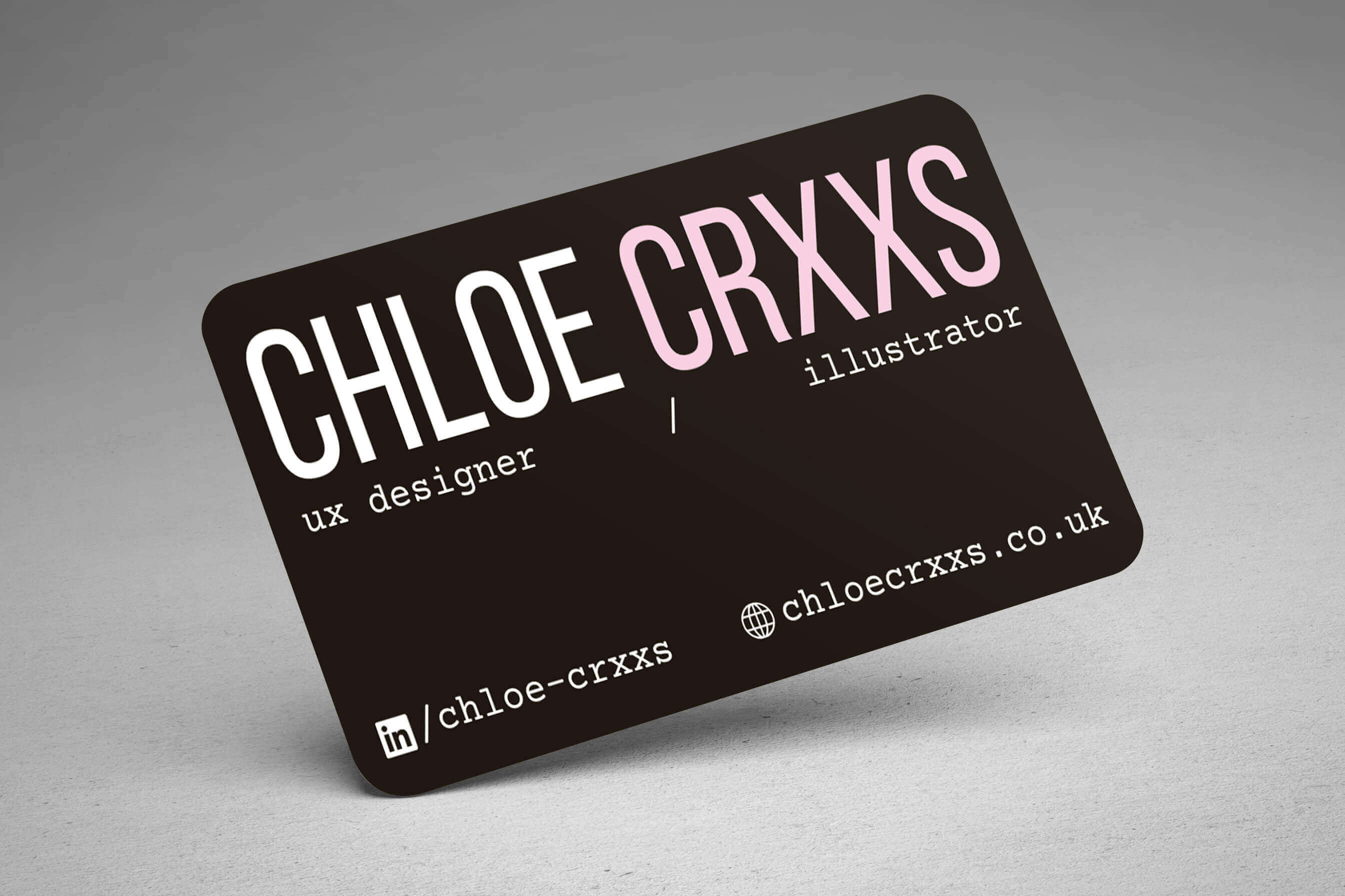
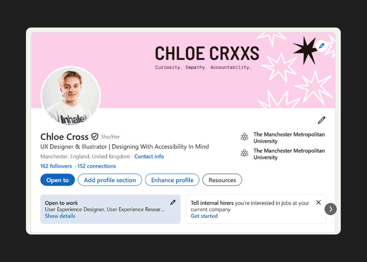
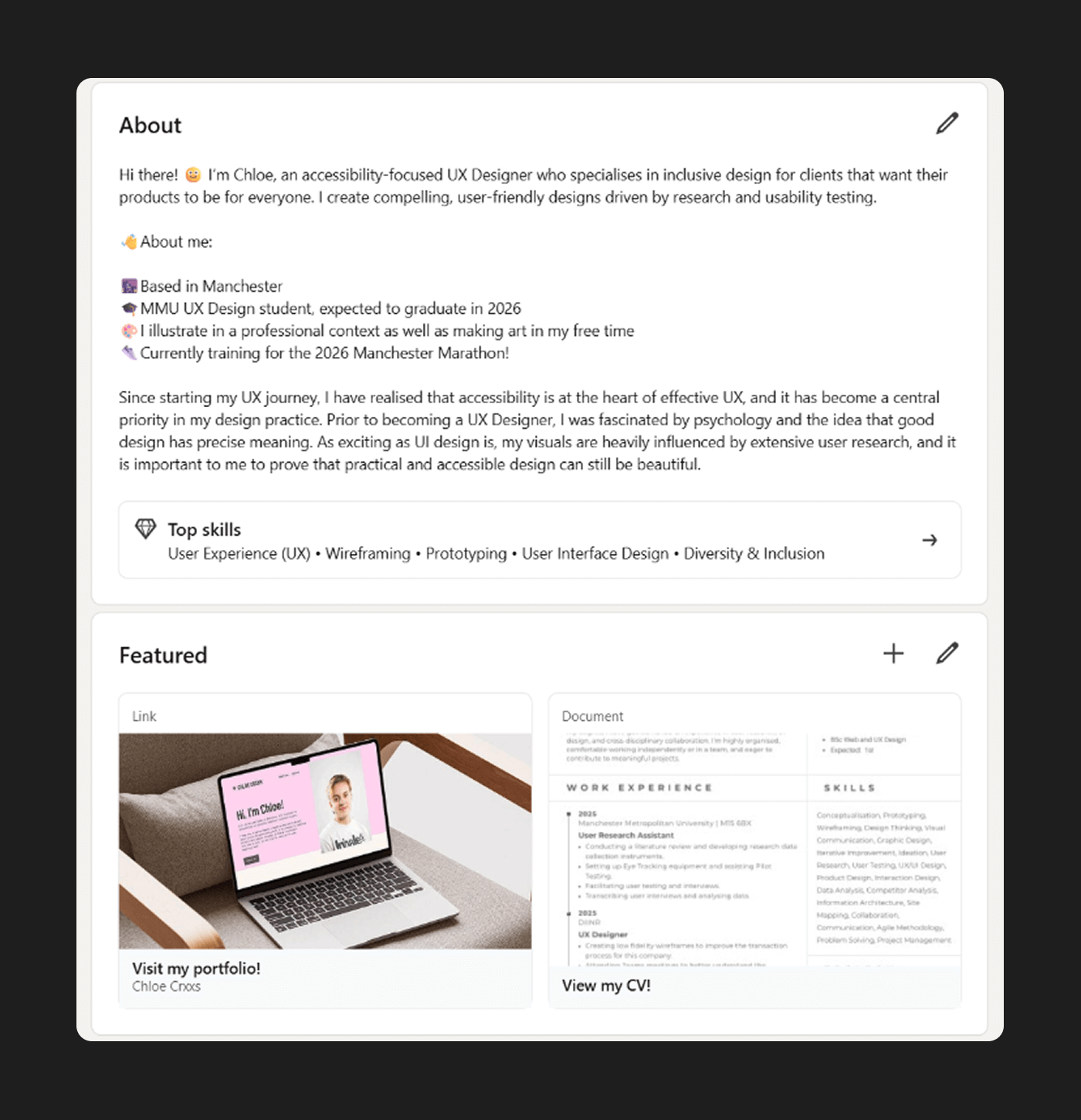
I took the opportunity to align my existing LinkedIn account with my personal brand. I created a header that mirrors the visuals used in my style tile, and updated my “About” section to feel more like me.
References
- B., I. (2023). What is a motif in design? How to create a unique design using motifs. [online] Creator-fuel.com. Available at: https://www.creator-fuel.com/blog/visual-charisma-standing-out-with-ease-through-motifs.
- Doody, S. (2018). 8 UX Mistakes To Avoid On Your UX Portfolio Website. [online] Medium. Available at: https://sarahdoody.medium.com/8-ux-mistakes-to-avoid-on-your-ux-portfolio-website-4d6dd437cf21.
- GOV.UK (2025). Contrast Checker. [online] Accessibility manual. Available at: https://accessibility.education.gov.uk/tools-testing/tools/contrast-checker.
- M., B. (2024). Principles of Typography in UI Design | by Bryson M. | Medium | UX Planet. [online] Medium. Available at: https://uxplanet.org/principles-of-typography-in-ui-design-bc28f1f9666d.
- Mantzios, M. (2023). Bold typography in UI: A shift towards strong visual hierarchies. [online] Medium. Available at: https://uxplanet.org/bold-typography-in-ui-a-shift-towards-strong-visual-hierarchies-2a184f865b2e.
- MockFlow (2025). Color Psychology in UI Design for 2025. [online] MockFlow – Blog. Available at: https://mockflow.com/blog/color-psychology-in-ui-design.
- WebAIM (2025). WebAIM: Contrast Checker. [online] Webaim. Available at: https://webaim.org/resources/contrastchecker/.
