Oranges
A collaborative project that explored how materials used in the past may be overlooked and forgotten, and how sustainability in design has evolved around that.

Process Overview
Background
The context: My co-collaborators and I were inspired by a unique 3D-printed lamp created from orange peel – the Ohmie Lamp, designed by Krill Design.
The aim: By combining the historical and modern uses of materials, we wanted to raise awareness of sustainability through a creative digital experience. We aimed to explore the materials used in the past, which have been overlooked or forgotten, and how sustainability in design has evolved.
My role: Illustrator and Visual Designer.
We wanted to spark meaningful conversations on sustainability.
Research
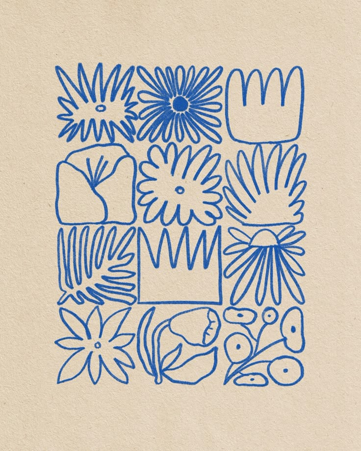
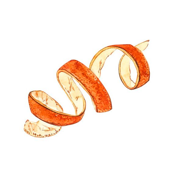
(Click to enlarge!)
As the illustrator for the project, my research was very design-focused. I looked into artists such as Tyler Elise Blinderman and Anna Asetrova, who’s works had been added to a collaborative mood board at the beginning of the project.
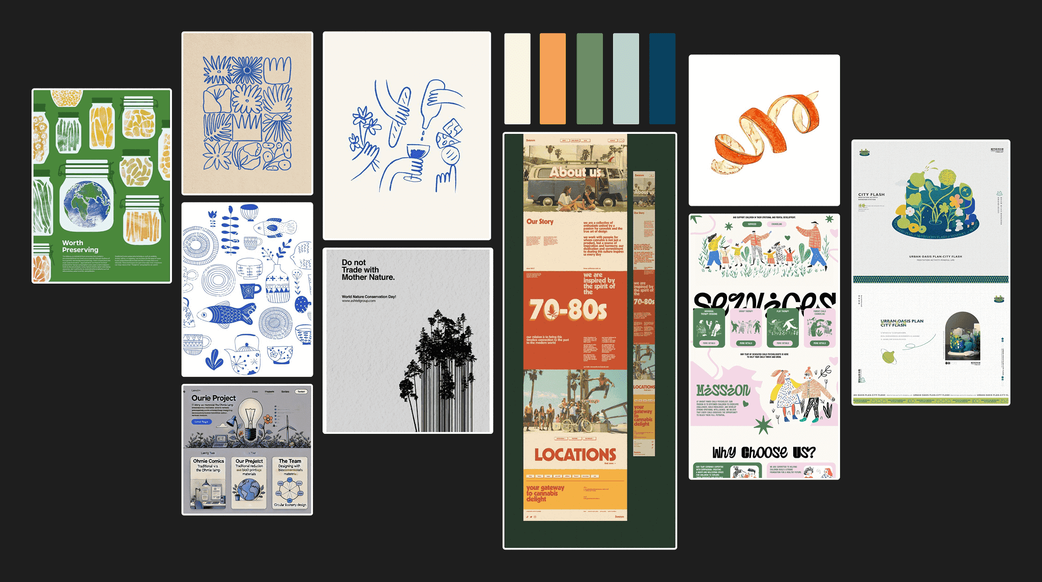
(Click to enlarge!)
Creative Response
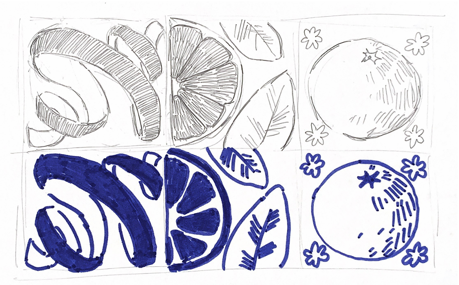

(Click to enlarge!)
Based on the mood board we created, I experimented with small, orange-themed sketches and various colour palettes.
My artistic output was influenced along the way by various factors:
- UX writing – the tone of voice of our website determined my illustration style.
- The Web Designer – I worked closely with them to decide on colour palettes.
- The Developer – they required my input when tying the website together.
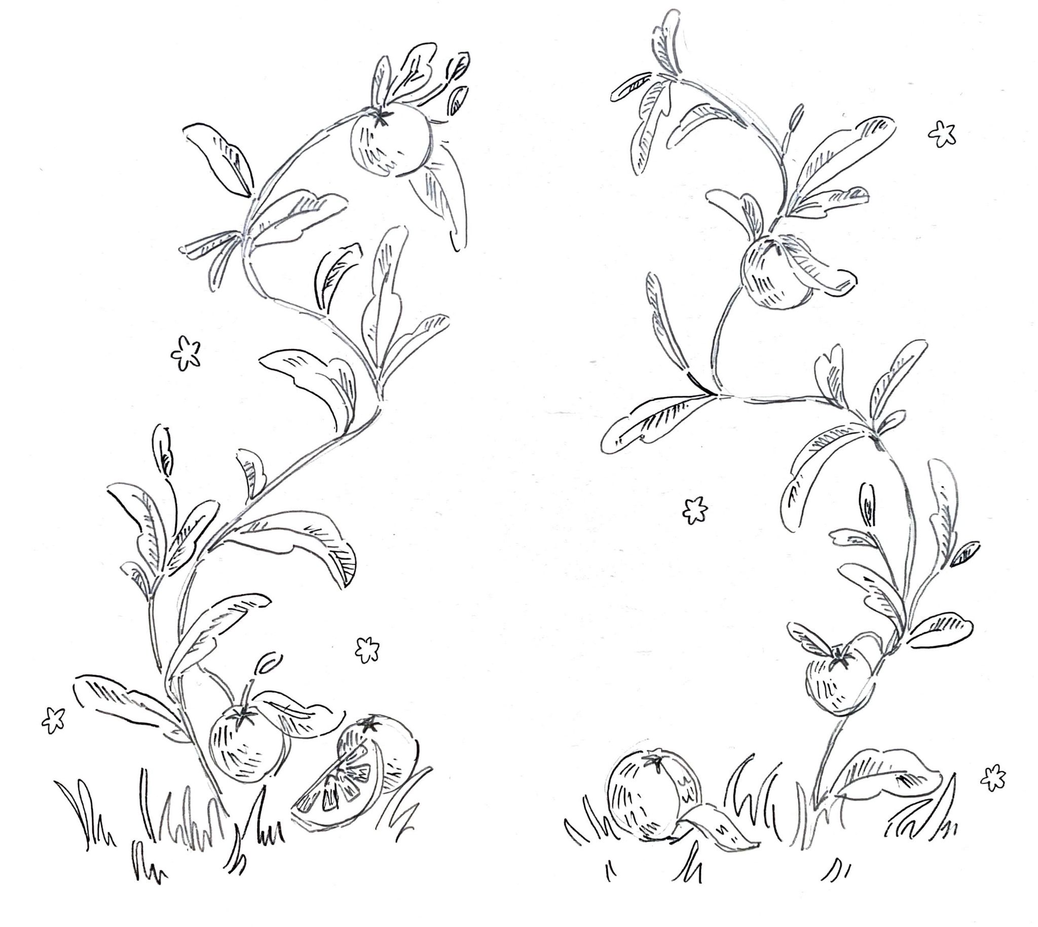
Border Design
(Click to enlarge!)
The tone was set as playful but informative.
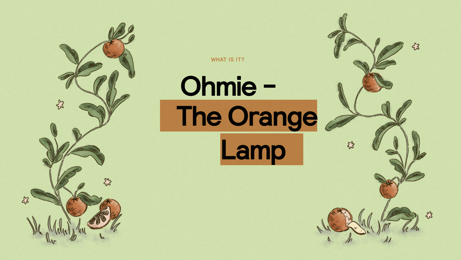
Our Web Designer created some mid fidelity prototypes, showcasing oranges and foliage. Using this, I produced this sketch for a potential border to the hero section of our website.

(Click to enlarge!)
I transferred this sketch to Photoshop, where I outlined and coloured it digitally, making it more suitable for use on the web. I wanted to keep the same hand drawn feel, as this was a major element in my opinion to setting the tone of the visuals.
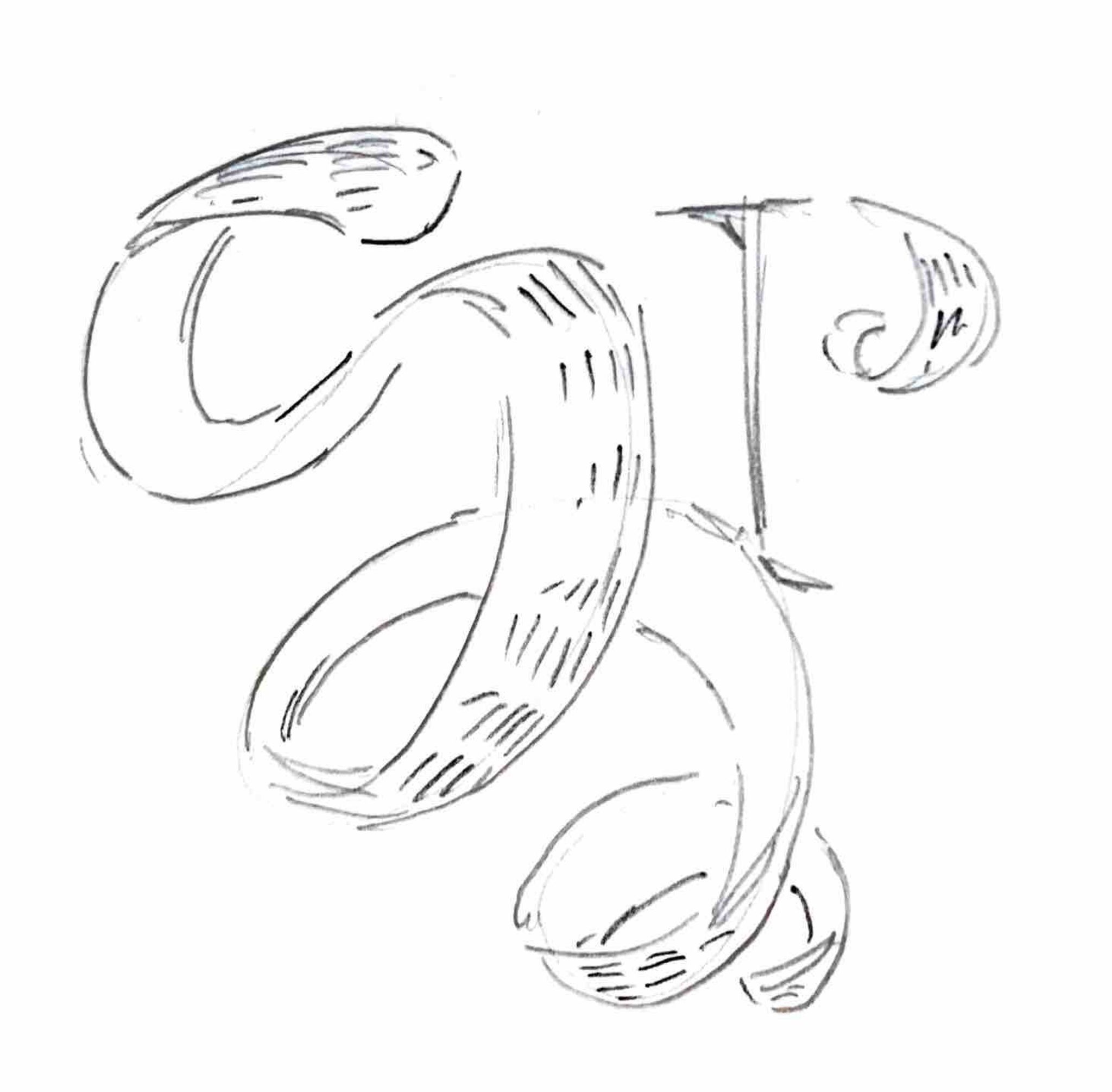
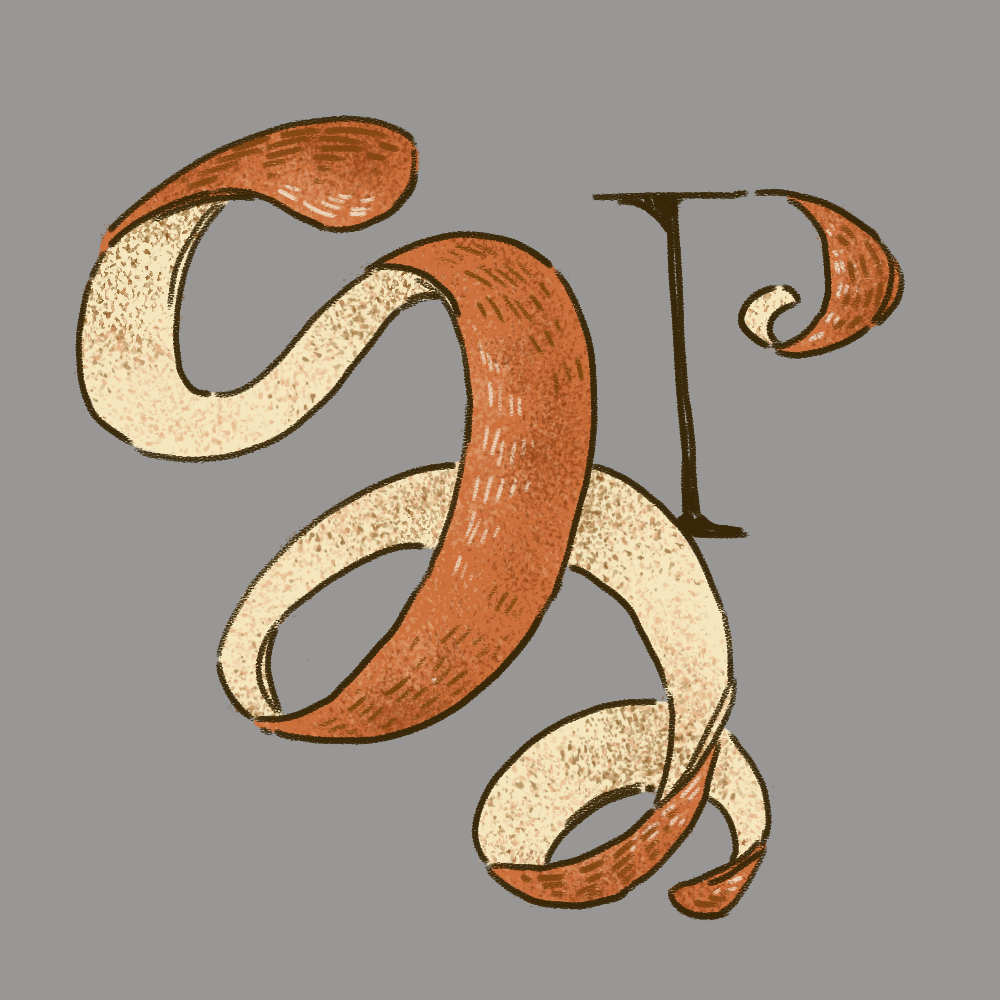
Logo Design
(Click to enlarge!)
I worked through a couple of ideas for the logo, but settled on a design inspired by the work of Anna Asetrova, as seen in my research.
Comic Design
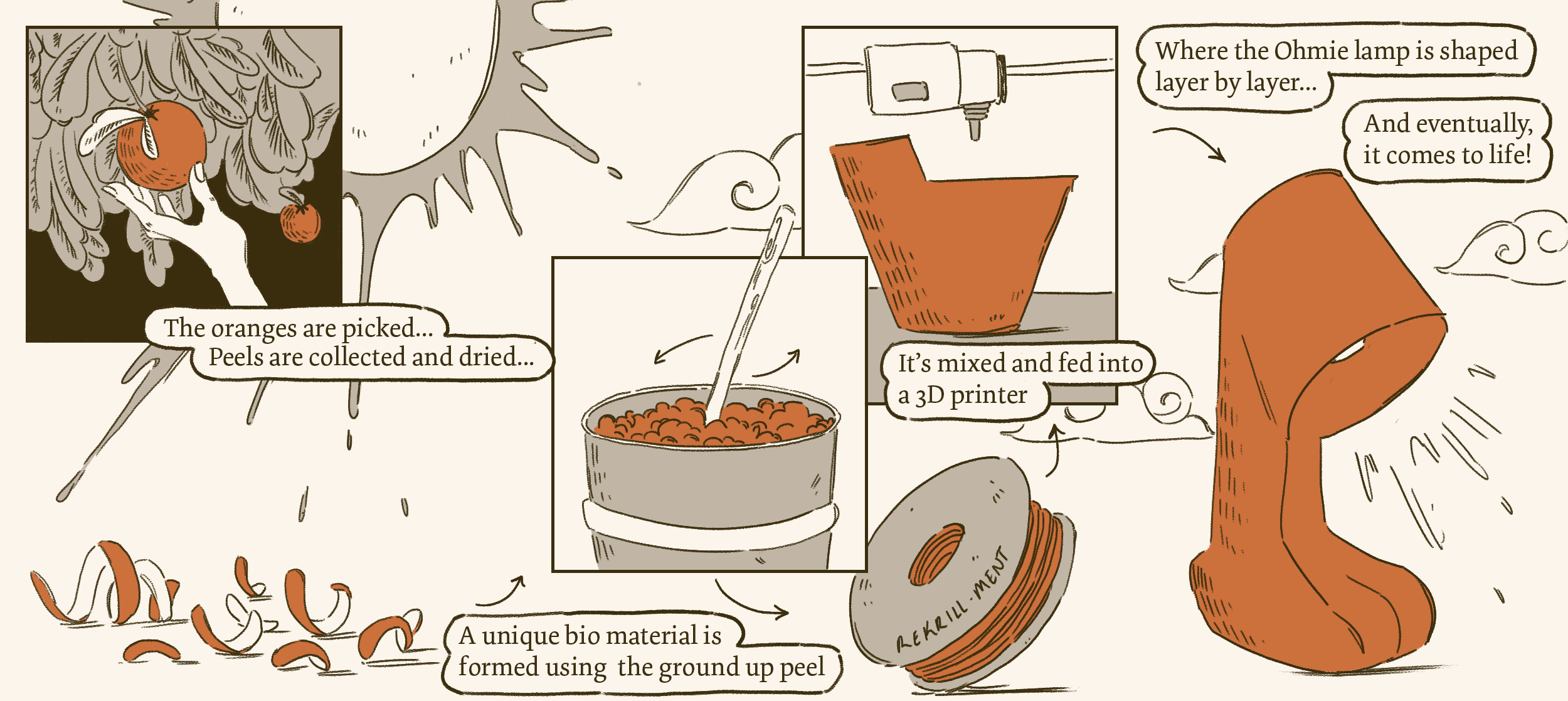
As a team, we decided that we wanted to tell the story of the Ohmie lamp, as our catalyst. We initially wanted to have a web page dedicated to a series of comics that explored sustainability, but this was ambitious for our timeframe.

(Click to enlarge!)
Instead, I illustrated a comic “cover” to segment the page layout and make the comic feel like a principle element.
(Click to enlarge!)
Final Project
(Click to enlarge!)