APE: User Research
A self-directed research project that involved user testing with eye tracking equipment to create informed improvements to the UX of a charity’s website: Artist’s Project Earth (APE).
Process Overview
Background
The charity: APE promotes sustainability in the music industry. They raise awareness through concerts, albums, art exhibitions and more, recruiting internationally known artists and collaborating with lesser known Afro-Caribbean artists. They aim to raise funds for campaigns and disaster relief.
The hypothesis: “Individuals are less likely to donate to Artist’s Project Earth due to their lack of a clear mission and general trustworthiness, in comparison to charities they have supported in the past.”
The aim: To use the research results to create a prototype redesign of APE, which will have a better informed user experience, and to test the success of this prototype on potential users.
Target audience
I intended to be loose with my target audience so that I remained open to feedback from a multitude of perspectives. However, individuals under this criteria may provide deeper insights:
- Sustainability advocate – Supporting APE means supporting the fight against unsustainable practices.
- Musicians – People who make music may feel a deeper connection to APE’s cause.
- Supporter of small artists – APE does more than just care about the planet; they make a point of providing a platform to lesser known creatives.
Primary research
To inform the redesign of APE, I needed to conduct some research on trust: what do users require from a charity in order to trust them? What makes you donate?

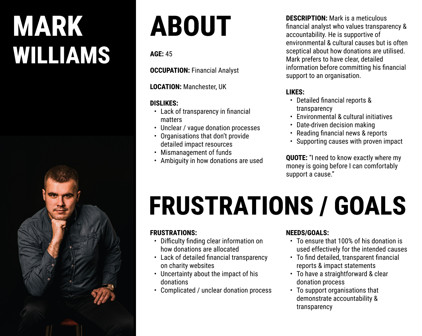
(Click to enlarge!)
I started by creating two personas – these gave me a better insight into who might be drawn to APE and who might feel more reserved about the charity.
I also conducted a focus group, which offered fantastic insights into what the website was lacking. Here are my key findings:
– APE needs a clearer aim: right now, there is a lack of clarity and there seems to be more than one aim.
– APE needs a better identity: the website’s aesthetic is confused, and doesn’t present like a charity.
– Communication is poor: users don’t know what their donations are being used for.
– APE doesn’t feel trustworthy: these combined points lead users to feel skeptical.
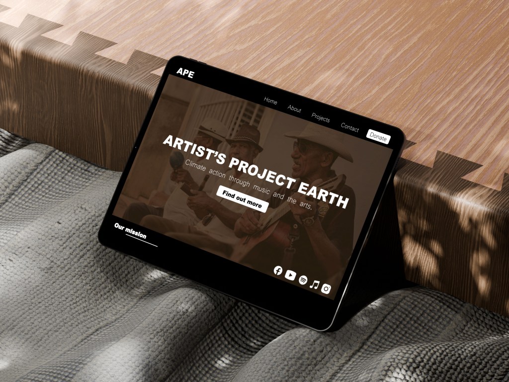
Prototype
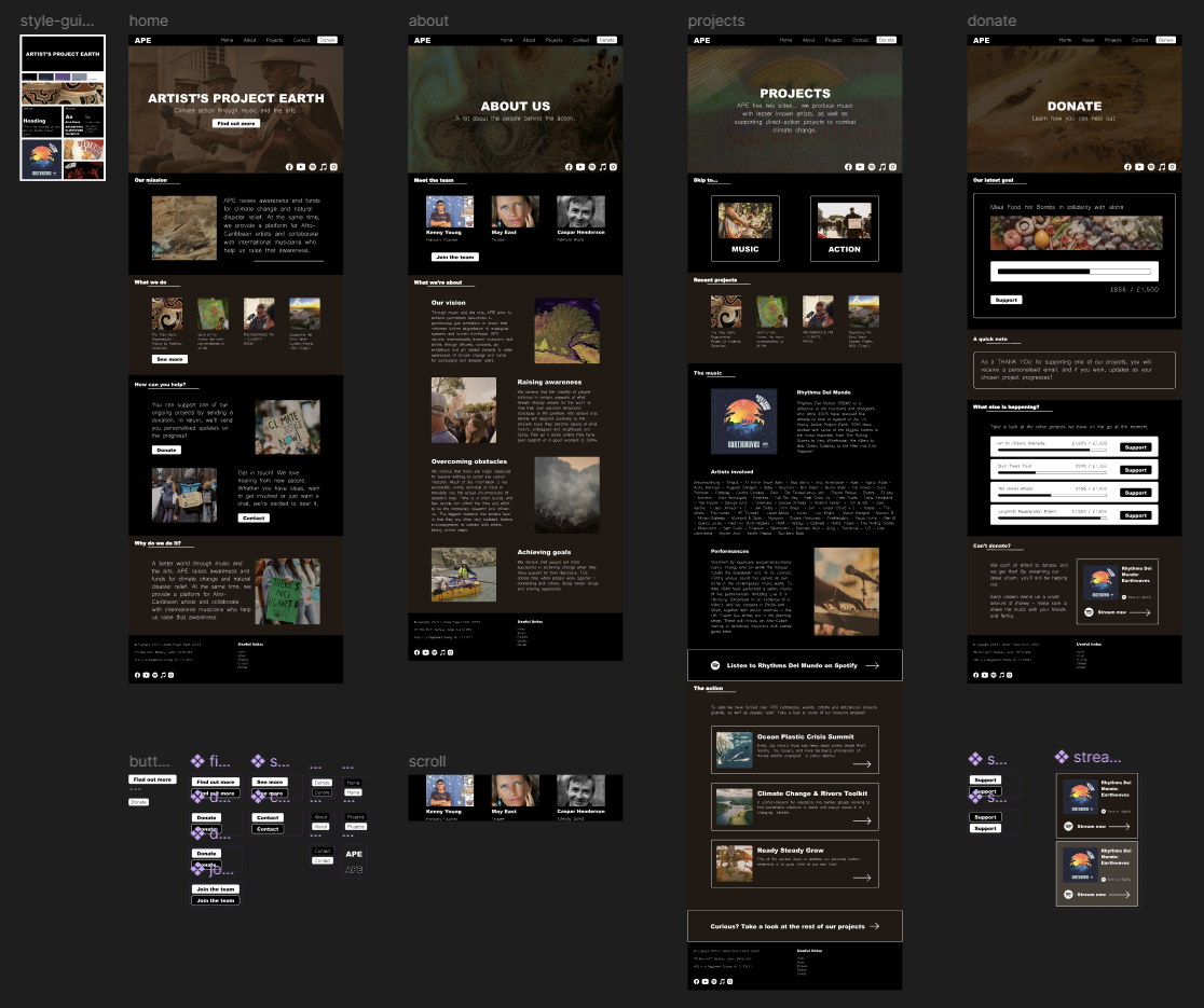
(Click to enlarge!)
I put together an interactive, high fidelity prototype that applied low carbon design considerations and accessibility principles.
Testing
I put together a research plan and recruited 5 participants (ppts) to test my design. I proposed 2 tasks:
- Imagine someone has told you to check out a new, interesting charity. Explore APE’s website – what do you think their mission is?
- Navigate to the donation page – consider if you would donate and not, and why?
Testing would be conducted using the Concurrent Think Aloud (CTA) method.
Eye tracking
During testing, I used the Tobii Fusion Pro software to track my ppts eye movements. This data offered me incredible insights on trust. I looked for if they gazed on trust indicators for an extended period of time, including:
- Elements that include upfront information.
- Connections to the wider web, or credible sources.
- Any certifications, such as a charity number.
Important note on accessibility:
One of my ppts was visually impaired, which led to some slightly different results with the eye tracking.
– They could not make out most of the copy, leading them to refrain from donating.
– The contrast between text and background was appreciated, but the smaller text was difficult to interpret.
Outcomes
– Clearer aim – APE’s aim was better understood and located in the redesign.
– Visual design improved – Users enjoyed the aesthetics and expressed an appreciation for a coherent identity.
– User trust improved – Users said they would trust APE as a result of their professional design and ties to big names.
